Gallery of Niwa

Client: Niwa Lombok Pearl
Location: Mataram, Lombok Island


 Prior to moving into new building, Niwa Lombok Pearl was a conventional jewelry shop located off Senggigi road. The new building is initially a house which has been renovated.
During the early meeting with the owner, I came up with an idea to change the concept from "Shop" into "Gallery". In my point of view, instead of getting face-to-face with a shopkeeper, jewelry customers will feel much comfortable in getting accompanied by a shopkeeper.

AREA ZONING & CONCEPT DESIGN
I divide the area into public and private area. As room divider, I use the existing storage belonged to my client and add a sliding door as room connector.


Click the image to enlarge

According to the research made by retail researchers, people tend to turn a left as soon as they coming into a shop. However, as you can see on the layout above, I place the lounge on the left side of the entrance. The reason is: The first stuff people see once they come in is a column to which I develop become a display. I can not move this column ( I wish I could turn into Hulk). They will step closer to the display-column if they get interested. Afterwards, I assume that they will be moving to the left side and "Bingo!" they see the lounge is there.

 Click the image to enlarge

So I intend to make the customers feeling more relax rather than insist them to be shopping in a hurry. Why relax? Because it's a jewelry gallery not seven eleven. One more thing, because my design concept is: Make yourself home.

THE DISPLAY
As I explained early, I intend to have customers getting accompanied instead of getting face to face with shopkeeper. So I place the displays stick to the wall as you can see in the following image:

   Click the image to enlarge
  
As you can see, there is a table with pouf chairs. The idea is to provide a place for customers to get consulted with the shopkeeper regarding the jewelry they have just picked up.

 Click the image to enlarge

On a corner of the main display, I put a single standing display for a more valuable collection. I put it exclusively behind the wall so people will not see it once they come in. 

COLOUR CONCEPT
The idea is to increase the good-looking-quality of the collection. Wood texture combined with white is so elegance that suitable for gaining the image of the gallery.

   
 Click the image to enlarge

 Click the image to enlarge

An Idea to Put Water Dispenser in the Kitchen

Client: Mrs. Suendar
Location: Lingkar Pratama, Mataram, Lombok Island


 Click on the image to enlarge

In this project, my objection is to create a simple kitchen in small dinning area. The problem is: the space is so small that somewhat difficult to manage the location of fridge and especially water dispenser.
The idea is to put the water dispenser right beneath the mini bar. As you can see in the picture above, I suggest my client to use an emerging product of water dispenser with the water-gallon underneath.

CEO's Room

Client: Mr Akem | Depo Jaya Bangunan
Location: Mataram
Designer: Panglima Erlangga
Contractor: WK Interior


Click on the image to enlarge

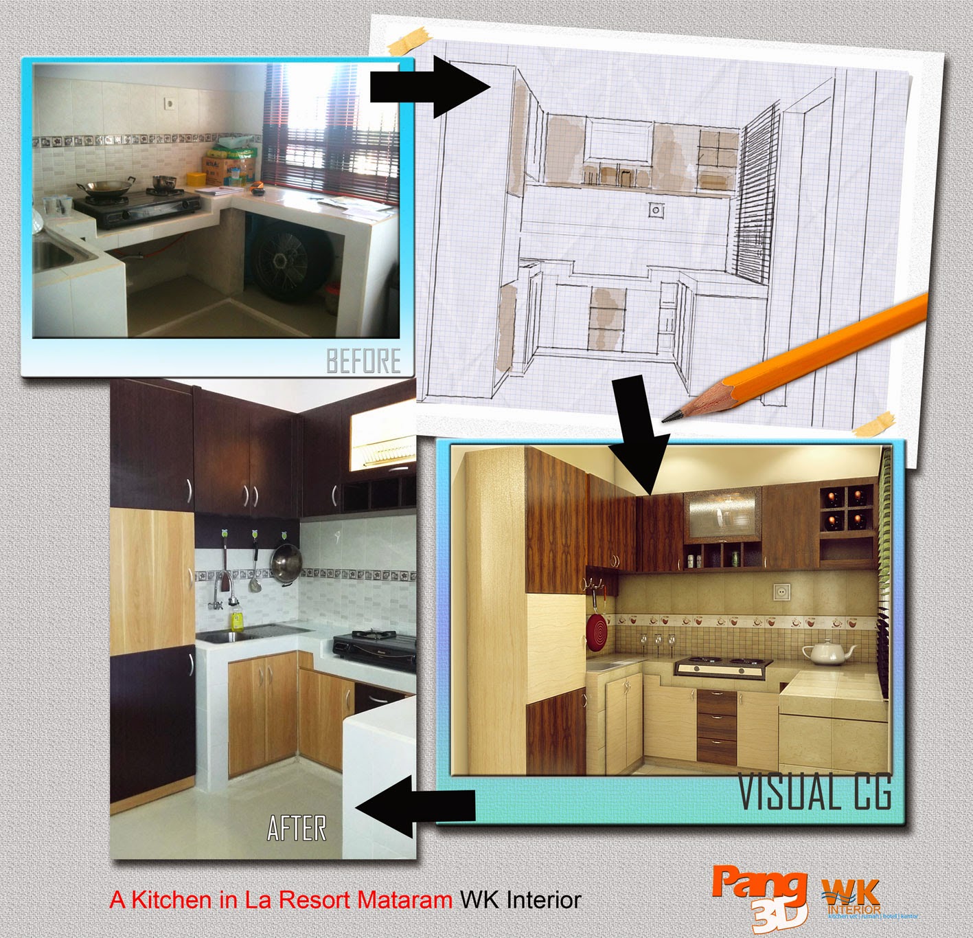
Making a Kitchen

Client: Mr Ersaka
Location: La Resort Mataram, Lombok Island


About Pantry and Kitchen

Sometimes we get confused of the difference between kitchen and pantry. According to Wikipedia, kitchen is a room or part of a room used for cooking and food preparation. Pantry is a room where food provisions, dishes, or linens are stored and served in an ancillary capacity to the kitchen. In my words, kitchen is for cooking raw food; pantry is place for food to place before getting served onto the dinning table.

Following image is a sample of my pantry design. Simply click on it to enlarge.


In the past time, within Asia home style, kitchen was mostly located at rear because cooking activity was categorized as a private activity. Nowadays, especially in urban style, cooking is not a private activity anymore. People tend to show what they cook. It is like how BreadTalk, in which people can directly see the bread making process. The company would like to convince their consumers that the bread is being cooked properly in a clean kitchen.

However, many people still tend to divide cooking area into kitchen and pantry.

Following image is a sample of my kitchen design. Click on it to enlarge.

Dehellenag's Make Up Studio

Client: Ellena Gunawan
Location: Riverside Park, Mataram City, Lombok


Following image is the design. Click to enlarge


My client is a famous wannabe make up artist. She needs a studio in which she and her employees may able to give the best service to their clients.

Function
The analysis of activity and needs were the first thing I got concerned with. The dimension was specified based on the existing site plan.
 Click on the image to enlarge

Design Concept
I did not even ask my client about the concept. I just asked her promptly what the stuff does she love to collect as a hobby. She loves collecting Hello Kitty stuff since childhood. Bingo! I got the the concept. I decided to play around with pink colour.

What Kind Of Pink?
Once I decided to play around with pink, I made some research about it. Based on my brief research, pink colour is same as white, which is potentially divided into families.  According to Interior Style book released by Benjamin Moore Paints, white can be divided into two families: warm whites, with yellow, pink or brownish undertones; and cool whites, with minty green or blue-gray undertones. In this case, pink is basically the result of red combined with white. More you add the amount of red, you would see the warmer pink. In the return, decrease the red you would get the cooler pink.

Warm Pink. Click on the image to enlarge

Cool Pink. Click on the image to enlarge

As you can see both images above, warmer pink has that impact: Sexy. The cool pink is more "princessy", reminds us to the princess movies. For this studio, I chose the warm pink to apply. To neutralize the effect of red, I used white as colour combination. In order to make the room becomes girly, I decided to cover the wall with rose-pattern wallpaper.

Why Tiffany Chair?
Tiffany chair is a kind of fancy chair probably invented by someone called Tiffany. It is chair without arm rest, made of wood, with pillow on the seat. I have suggested my client that this kind of chair is not comfortable to use specially for a make up studio. However, my client insisted to have fancy chair instead of comfort one. 

Following images are the result of the design. Click on the images to enlarge.


How Do The Designers Help?


Once my teacher said there are 3 activities designers have to do: Thinking, thinking and thinking. Clients have Designers to sort their problems out. Designers, by using design method, help clients basically to make their life easier.

There are various aspects in interior design that potentially having impact towards daily life. Thus designers are concerned about ergonomic, colour effect and some designers are thinking about new idea of making innovation to make live become easier.

Some people believe they don't need interior designers. Indeed, some of them understand about problem solving. But, sometimes people just don't realize that there are many things in architectural stuff they don't know well.

In this case, I would like to give you very simple example using one of my kitchen projects.
 Project Location: Puri Hijau Senggigi, Lombok Island Client: Mrs Nuri, an Australian & Indonesia citizen

My client had a kitchen built by the home developer. In Lombok, Real Estate Companies tend to build houses unfurnished. They only provide simple kitchen made of concrete finished commonly with tiles. But in this project, I found the kitchen had been finished with granite stone and tiles applied on to the wall.

  Click the image to enlarge
 
As you can see, the kitchen is so tiny. It doesn't even set along the wall. So it is like somebody has cut it off. When I started designing this kitchen, I was mostly concerned about the red on the wall. What should I do with the Red?

So after brainstorming the problems, I started making the sketch.

Click the image to enlarge

Afterwards, It's time to play with colour. I create colour-combination option. It was not easy to decide which one is going to work well. Red is a kind of strong colour. It may give impact to your life. I think it is good idea to put RED into your kitchen because RED has ability in gain your eating desire, which means, too much RED will make you getting fat instantly.


 So far, I thought It was time to discuss with the client. Are you a designer? I am telling you: Clients will be happy when you report the progress constantly. They are happy to get involved. You have to engage the client to make sure their problems have been sorted out.

Eventually, I came out with the final design. Deal. My client were happy with the design. Then I brought the working sheet over the workshop. Technical problems will show up during installation, it is normal though. Drawing Plan is made on paper. Kitchen is not standing on a paper sheet. So it is important to be flexible with changes.

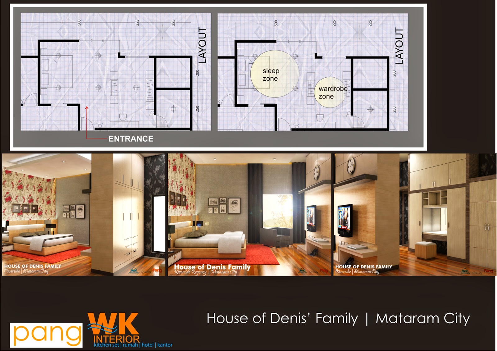
ROSE POWER IN BED ROOM

Client: Dennis' Family
Location: Mataram City, Lombok island
Interior Contractor: WK Interior


The idea is to put red as accent into the bed room. As this room is a master bedroom in which the user is a mature couple, I choose rose as a concept to put into the atmosphere of the room.

I divide the room into sleep area and wardrobe area which is separated by a TV panel.

Click on the image to enlarge

FORTUNE HOTEL; FRIENDLY WITH ORANGE

Project: Interior Lobby Area of Fortune Hotel, Mataram, NTB
Client: Fortune Hotel
Design & Visual: Panglima Erlangga
Interior Contractor: WK Interior


Within this project, my job is to design the front area of Fortune Hotel which is consisting: Receptionist, Lounge and restaurant area. Those items are placed on the ground floor.

Let's Start Based on the Logo
When designing something such as Commercial Brand stuff, I use to start paying attention to the Logo. I reckon that prior to specify the architectural look, the owner should have been choosing the Brand-Logo. Thus a logo is supposed to be reflecting what the clients intend.

Image of the hotel is curved-letter and colorful. The font is similar to Fender ( a brand of music instruments). Thus the exterior building consists of three colors: Red, Yellow and orange. So far, the existing exterior building has been engaged with the style of the Brand-Logo. However, Regardless the color of the brand logo, I chose Orange to be applied into the Lobby area. The reason is that Red is too strong for welcoming visitors. Orange is more friendly.

Receptionist Area
Among the the option I was offering, my client has chosen the one with curved-ceiling as you can see on following picture.
If you were wondering about technical way of creating the split-curved-ceiling (just in case you are not into technically architectural stuff) here I show you the Working in Progress Image I captured during the project:

During the project, after having many discussions with the client, I eventually make several changes. Considering to get more attendants in restaurant, I decided to enlarge the lobby resto. Following is the final image of the lobby:


The Lobby Lounge
I was playing around with Orange color eventually found that orange can be combined well with vivid colours. To get the surprising firs impression, I played around Orange with graphical stuff on the wall.


 In the corner, I placed a small lounge with Red wall covering applied onto the wall.


Since the lobby restaurant has been enlarged in order to add the capacity, I have made a little bit tweak as you can see the photographs below:


Breakfast Area
Since the restaurant is located within same area with Lobby area, I thought about how to engage it with the lobby related to the style and colour. Thus I chose graphical stuff to applied onto the wall instead of making it either elegant nor luxurious.
 As you can see, there is mirror along the wall and cutting sticker depicting a ruler. Regarding the ruler, I chose Ruler as the graphic decoration for making it different to any other hotel in the universe. You can see more detail on picture I  have already taken below.


You can have a look at the food-display much more detail by using picture below:


SMALL BUT SWEET HOME LIVING


Client: Mrs. Lia
Location: Graha Majapahit, Mataram, NTB
Designer: Panglima Erlangga

Contractor: WK Interior

 The idea is to create small budget home interior decoration within a small house. I decided to create furniture which is inexpensive to create. Thus I applied wood-working looks alike furniture using plywood layered by High Laminated Pressure (HPL). I chose two prominent HPL with Walnut textures.

 Click on image above to enlarge

Problem
The Indonesian style of home-living interior, conventionally, is that there are two living rooms available. First one is as a lounge for hosting guests. The second one  is as common room for family. Thus actually if you say Living Room, that refers to a lounge for Guests. 
According to the culture I've elaborated early, It was no chance to create two living rooms. Thus I design a common room suitable for guests and family. That is why the title of this project named: Small And Sweet Home Living.