Howard's Kitchen

Project location: Green Valley Senggigi, Lombok
Client: John Howard Singleton

I don't drink coffee I take tea, my dear
I like my toast done on one side
- Englishman in New York by Sting- 
My client is an English man having a semi-villa house nearby Senggigi beach, Lombok. He has provided a room at the rear of the house.
  
FIRST PRESENTATION
The analytics of needs I have made based on interview with him, it concludes that the kitchen must accomodate activities such as: cooking, dinning for 3 persons, cutlery cleaning and saving, food serving and laundry. Yes, laundry, as there's no space for laundry which means kitchen is the only place the laundry machine placed at. Here is the plan:


As you can see on the image above, the laundry area and wash basin are separated by standing stove. Briefly speaking, it.s not efficient. However, the key is what behind the wall. It is empty area or you can say it as backyard.


Attempting to not wasting spaces, the dinning table is sticked to the wall using metal construction and dynabolt. I use stool instead oif dinning chair.


SECOND PRESENTATION


During the second presentation, I came up with the design and fixed quotation (the raw price has been given and agreed on first meeting). Note: budget quotation should not go over the limit agreed on the previous meeting. As you can see on picture above, there are two colour option. In fact, two is less. It turned out that the client wanted more.

THIRD PRESENTATION
Following illustration is the final design. The colour has been tweaked, the stool has been changed into light plastic chair.


 Here is the list of material applied:
  • COUNTERTOP. Granite stones.
  • DINNING TABLE CONSTRUCTION: Hollow metal 3,5"
  • CABINETS. Plywood finished high pressured laminate
  • WALL PANEL BETWEEN CABINETS. Tile (has been existed prior to the design)
INSTALLATION
Following is a picture depicting installation process.


Thank you for reading my blog. For further information, feel free to contact me on Linkedin, simply click HERE


Mr Lalu Arya's Home | First Floor

Client: Mr Lalu Arya
Location: Mataram, Indonesia

Interior Contractor: WK Interior

Before getting started, let me put it this way: In Indonesia, ground floor is perceived as first floor. So when I say first floor, it reffers to the lowest floor.

Now, let's get started.

This 3 floors house is belonged to a couple who runs restaurant business. Mr and Mrs Arya have been building their new house with sophisticated fixture including fish pond on second floor with side pool and jacuzzi on third floor. The first floor contains of: kitchen and master bedroom.


PROBLEM
My client started contacting me as soon as the walls were raw built but not finished yet. Rooms are already existed including cable installation and concrete ceiling. The problem is: they did not hire architects for planning their house. Therefore, there are few issues I am concerned about such as zoning and grouping connection, circulation, kitchen countertop which is existed but not at standard height, built-in wardrobe which is situated in inappropriate location, etc. Lesson: Are you going to build a house? Get architects to work with!

KITCHEN
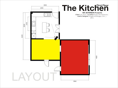
Following is the layout of kitchen area on first floor. Click on the image to enlarge.


As you can see on picture above, the kitchen consists standing unit for refrigerator and water heater, sink and gas stove which is going to instaled on to the countertop. My client requested a electrical dishwasher. I put it nearby the sink for plumbing efficiency.


The idea is to apply wooden ellegant kitchen with White as the accent. Brighter wooden texture used to combine with the darker one to create classic-look effect.

MASTER BEDROOM
As I said before, the problem of this project is that there was architect involved in planning the building. My clients have provided a built-in wardrobe storage made of wall in the master bedroom on their behalf, completed with TV antenna cable installed in the wall.


The problem is: In my point of view, the wardrobe is supposed to be situated there, however, built in wardrobe is not necessary as wasting space. All I can do is creating the wardrobe storage along with TV panel as efficient as possible.


The White colour depicted on image above is the wall. The sliding doors are intended to make the doors possibly opened. The intereseting fixture is: Do you see a Gibson guitar character?


At "sleeping zone", classic and modern are collided intentionally. The headboard is made of 4 inches thickness sponge covered with fabric in squares pattern. That one is modern. Wooden wall panel and oriental wallpaper pattern are representating classic.

Small And Simple Bedroom For Kids

Client: Agus
Location: Bale Pelangi Lombok
Interior Contractor: WK Interior

 OBJECTIVE
I have two rooms to design. Both are about 6,50 metre square. My objective is to accommodate all kid's activity and to provide enough storage for kids to keep their stuff so their bedroom will always be tidy.


 Click image to enlarge

As you can see on picture above, this bedroom accommodates all kid's activity such as sleeping, study, playing games, watching tv and wardrobe activity. Storage is provided well beneath the bed to avoid messy look.

COLOUR CONCEPT
The idea is to create connection between two rooms through colour. The picture above is the elder brother's room. His favourite colour is orange and the younger one is green. Initially, I apply their favourite colours onto the wall. The next step is to reduce the prominent colour with white and create colour accent with combination of dark grey and the favourite colours of his brother, which is: green.
Following picture is his young brother's bedroom.

Click image to enlarge

As you can see, the same colour concept has been applied. Orange which is applied as prominent colour in the elder brother's room is getting applied as colour accent in the younger one. This is what I am saying about: Connection.

Kitchen in a Trapezoid Room

Client: Desta
Location: Mataram, Lombok

Interior Contractor: WK Interior

The advantage of custom furniture is that custom products can be put into space where mass products can not fit into. This project is such a good example.


Summary: Drawing plan & photos

PROBLEM
The shape of the room is isosceles trapezoid. I managed to set the cabinet towards the tilted wall.

3D Drawing plan. Click to enlarge.

The core key is the kitchen's corner as the joint of two cabinets. I designed the corner table 20 cm higher than the counter top. The idea is I would like to manipulate the visual, let's say I attempted to create a visual effect to reduce the sense of  room shape which is irregular.

Secret Wardrobe Area

 
Location: Mataram
Client: Michael

My client needs a secret room in his bedroom. 
The problem is: I have to design connecting door which is camouflage. 


As you can see the drawing plan above, the idea is to hide the wardrobe room using two sliding doors as entrance. So when you open the first door, you will find a small storage for suitcases and clothes.

Kid's Bedroom

I am telling you a secret: In front of a mirror after shower time, I often whisper to myself, "I'm Batman!"
What we used to do in childhood tends to be considerable as ridiculous when mature people do that. This consideration, for me, is such a "character murder", a sort of violence that is more evil than Hannibal or Joker...
When I have a bedroom to design, specially for a single mature person, during the first meeting  I sometimes tell clients that there is a chance to have bedroom that keeps them connected to their childhood fantasy; nobody would know it. 

The Pianist
My client has a daughter who was about to enter university. She played keyboard in a band at her school. This was the idea I came up with.


Girly Warhol
Girls love Andy Warhol, especially girls of 70's.
My client is a girl who is nearly going to high school. She knows nothing about Warhol and his legacy. But Warhol is Warhol. His art style always be loved by girls.


Blue
Blue is the most favorite colour in USA. If you are not too sure, google it!
Boys tend to love blue. When I started designing a bedroom for my client's son, I was asking what is his favorite colour. His parents were not sure, then I kept asking: What's his favorite football club? Chelsea was the answer.

Donald Duck's Nephews
Another clients have three kids. They sleep in one large bedroom.
Donald's nephews came up in my head although I was sure these kids know nothing about Walt Disney.


Mom, Im not a child anymore!
Some teenagers do not want to get look childish. These kind of teens tend to love style of elegance, mature and sober.
Previously, I have shown you 'Blue Bedroom'. That room belongs to a boy who has a elder brother who feels he is a serious man. So I designed a bedroom for him with elegant concept.


Geoff Fowler's Kitchen

Client: Geoff Fowler
Location: Green Valley, Senggigi, Lombok


My client needs a kitchen within an open space home. Thus, in order to separate the kitchen from dinning area, I put an island table as mini bar.

Design Concept
I created a symmetry kitchen with stove and cooker hood as the central point. There is enough storage for books and accessories and water heater as well. I played around with bright and dark wooden texture to create elegant and dynamic look.

Kitchen and Laundry in One area

Client: Steward
Location: Batulayar, Senggigi, Lombok


My client is an Australian who just finished building up a house nearby Senggigi beach.
He has provided a room for cooking, dinning and laundry.
I combined the dark oak texture and black granite stone applied onto top table. The result is elegant. My client is happy with it.

Master Bedroom of Dr Yusra's

Client: Dr Yusra Pintaningrum
Location: Mataram City, Lombok

Layout Plan
The size of this master bedroom is 20 metre squares. I split the room into two different areas: Rest area, including wardrobe and hair dressing, and storage area, additional wardrobe to keep shoes, bags and bed cover.


As depicted by layout plan above, I use a standing TV panel as room divider. This 2-side- panel can be used as wardrobe storage on opposite side.

Style
My client is a young couple who both are doctors. Initially, they, specially the wife, talked about modern minimalist which form follows function. However, I offered them to add a little bit classic atmosphere by applying small amount of oak wood texture.


The wood texture eventually changed with maple. As you can see images above, wood colour is different between what has been visualized on 3d visual and the reality photos. This circumstance occurs as I have often told you that a design we created on paper tends to develop during the progress. But, this change is not going out of the design concept.


As shown by two images above, material of wardrobe's has been changed from solid ivory to mirror. I changed it into mirror to make the room visually larger.

Home Office

Client: Heru Sutrisna
Location: Mataram City, Lombok Island


DATA & LAYOUT
My client needs an office in his home which is capable of accommodating work-activity. This office is located in the front area of his house. This office will provide equipment such as:
- CCTV
- Modem
- Telephone
- Battery Charger
- Computer
- Printer
- Archive storage
- Key storage
Layout plan. Click the image to enlarge

As you can see on the layout plan above, my plan is to design a computer-desk and a big storage with power outlet on both furniture.

PROBLEM
To accommodate the equipment/ gadget, the furniture must provide power outlet. Therefore, cable installation is the main problem. Cable must be installed inside the furniture otherwise the room will get messy.

CCTV cable. Click to enlarge

The picture above is CCTV and internet cable. All will be hidden and installed on the storage.

PROBLEM SOLVING | COMPUTER DESK
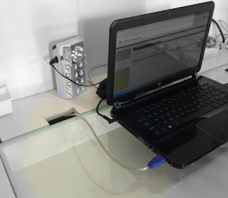
This computer desk is facilitated with power outlet and a box to save printer cable. You can see the detail below:

Click to enlarge

As you can see, the computer desk is connected to the cabinet so the printer can be placed in the storage instead of on the desk. Following are the detail images of how this desk works:


THE CABINET
The function of this cabinet is to save archives, books, keys and also to save laptop or hand phone while charging.


DESIGN PROCESS
Following picture is the Computer-Generated 3D visual and the drawing plan.

 Visual 3D

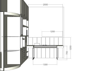
Drawing Plan. Facing the Cabinet

Drawing Plan. Facing the computer desk

Under Construction
Final Result