Kid's Bedroom

I am telling you a secret: In front of a mirror after shower time, I often whisper to myself, "I'm Batman!"
What we used to do in childhood tends to be considerable as ridiculous when mature people do that. This consideration, for me, is such a "character murder", a sort of violence that is more evil than Hannibal or Joker...
When I have a bedroom to design, specially for a single mature person, during the first meeting  I sometimes tell clients that there is a chance to have bedroom that keeps them connected to their childhood fantasy; nobody would know it. 

The Pianist
My client has a daughter who was about to enter university. She played keyboard in a band at her school. This was the idea I came up with.


Girly Warhol
Girls love Andy Warhol, especially girls of 70's.
My client is a girl who is nearly going to high school. She knows nothing about Warhol and his legacy. But Warhol is Warhol. His art style always be loved by girls.


Blue
Blue is the most favorite colour in USA. If you are not too sure, google it!
Boys tend to love blue. When I started designing a bedroom for my client's son, I was asking what is his favorite colour. His parents were not sure, then I kept asking: What's his favorite football club? Chelsea was the answer.

Donald Duck's Nephews
Another clients have three kids. They sleep in one large bedroom.
Donald's nephews came up in my head although I was sure these kids know nothing about Walt Disney.


Mom, Im not a child anymore!
Some teenagers do not want to get look childish. These kind of teens tend to love style of elegance, mature and sober.
Previously, I have shown you 'Blue Bedroom'. That room belongs to a boy who has a elder brother who feels he is a serious man. So I designed a bedroom for him with elegant concept.


Geoff Fowler's Kitchen

Client: Geoff Fowler
Location: Green Valley, Senggigi, Lombok


My client needs a kitchen within an open space home. Thus, in order to separate the kitchen from dinning area, I put an island table as mini bar.

Design Concept
I created a symmetry kitchen with stove and cooker hood as the central point. There is enough storage for books and accessories and water heater as well. I played around with bright and dark wooden texture to create elegant and dynamic look.

Kitchen and Laundry in One area

Client: Steward
Location: Batulayar, Senggigi, Lombok


My client is an Australian who just finished building up a house nearby Senggigi beach.
He has provided a room for cooking, dinning and laundry.
I combined the dark oak texture and black granite stone applied onto top table. The result is elegant. My client is happy with it.

Master Bedroom of Dr Yusra's

Client: Dr Yusra Pintaningrum
Location: Mataram City, Lombok

Layout Plan
The size of this master bedroom is 20 metre squares. I split the room into two different areas: Rest area, including wardrobe and hair dressing, and storage area, additional wardrobe to keep shoes, bags and bed cover.


As depicted by layout plan above, I use a standing TV panel as room divider. This 2-side- panel can be used as wardrobe storage on opposite side.

Style
My client is a young couple who both are doctors. Initially, they, specially the wife, talked about modern minimalist which form follows function. However, I offered them to add a little bit classic atmosphere by applying small amount of oak wood texture.


The wood texture eventually changed with maple. As you can see images above, wood colour is different between what has been visualized on 3d visual and the reality photos. This circumstance occurs as I have often told you that a design we created on paper tends to develop during the progress. But, this change is not going out of the design concept.


As shown by two images above, material of wardrobe's has been changed from solid ivory to mirror. I changed it into mirror to make the room visually larger.

Home Office

Client: Heru Sutrisna
Location: Mataram City, Lombok Island


DATA & LAYOUT
My client needs an office in his home which is capable of accommodating work-activity. This office is located in the front area of his house. This office will provide equipment such as:
- CCTV
- Modem
- Telephone
- Battery Charger
- Computer
- Printer
- Archive storage
- Key storage
Layout plan. Click the image to enlarge

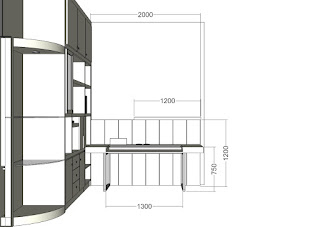
As you can see on the layout plan above, my plan is to design a computer-desk and a big storage with power outlet on both furniture.

PROBLEM
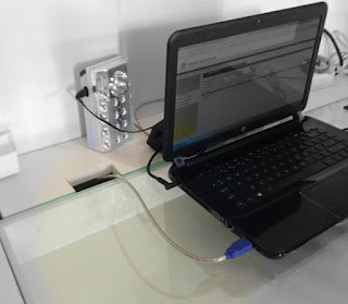
To accommodate the equipment/ gadget, the furniture must provide power outlet. Therefore, cable installation is the main problem. Cable must be installed inside the furniture otherwise the room will get messy.

CCTV cable. Click to enlarge

The picture above is CCTV and internet cable. All will be hidden and installed on the storage.

PROBLEM SOLVING | COMPUTER DESK
This computer desk is facilitated with power outlet and a box to save printer cable. You can see the detail below:

Click to enlarge

As you can see, the computer desk is connected to the cabinet so the printer can be placed in the storage instead of on the desk. Following are the detail images of how this desk works:


THE CABINET
The function of this cabinet is to save archives, books, keys and also to save laptop or hand phone while charging.


DESIGN PROCESS
Following picture is the Computer-Generated 3D visual and the drawing plan.

 Visual 3D

Drawing Plan. Facing the Cabinet

Drawing Plan. Facing the computer desk

Under Construction
Final Result


Small But Roomy Dining Area


Client: Ridwan Maulana
Location: Lingkar Harmony | Lombok | Indonesia

The dining area consists of kitchen and dining table. Black granite stone is used as countertops for the kitchen. For dining table, I use wood material. To split these two different countertops, I create split level: the kitchen is 85 cm which is height-standard for kitchen, as for dining table is 75 cm height.
As you can see on the drawing plan, there is additional "drawer" between the wall and refrigerator. Technically, it's a vertical drawer with wheels instead of railway.
The top cabinet is up to ceiling, so there is enough space to save equipment, or let say: mini warehouse in the kitchen. Instead of common material such as mozaic, I use mirror to make this dining area looks light and roomy.

May's Boutique at Lombok Epicentrum

Client: May's
Location: Lombok Epicentrum Mall
Interior Designer: Panglima Erlangga
Interior Contractor: WK Interior


May's - Click image to enlarge

DESIGN CONCEPT
Let space makes space for fashion to talk. It was the idea I got started with. As the market target is upper - class fashionable women, I was concerned about simplicity instead of glamor. The interior has to accommodate the fashion to show off by itself.

Lay out & design illustration - Click image to enlarge


As you can see, the dominant colour is white and the sub dominant one is hot pink. Those colours are chosen as the brand-colour of the shop. I need something to catch people's eyes and to prevent customers not to get bored with the atmosphere,  so I add yellow and turquoise combined with wood texture as accents.

SHOP FRONT
Basically, the design is conventional: Using window display for mannequin to put in. It is not that simple though, as shop front is the first stuff people to see. It must be somewhat unique and be the character of the brand product.
Front shop design - Click image to enlarge

According to a research regarding retail design, smaller front door physiologically creates a mindset: There is something exclusive behind it. That is the reason I suggested a single-glass-door instead of a wide rolling door. Following images are the shop front taken in long shot and the window display:


Window display - Click image to enlarge

DESIGN RESULT
Following images are the another photos depicting the design result. These images were taken with iPhone 5c. Click on the picture to enlarge.


Gallery of Niwa

Client: Niwa Lombok Pearl
Location: Mataram, Lombok Island


 Prior to moving into new building, Niwa Lombok Pearl was a conventional jewelry shop located off Senggigi road. The new building is initially a house which has been renovated.
During the early meeting with the owner, I came up with an idea to change the concept from "Shop" into "Gallery". In my point of view, instead of getting face-to-face with a shopkeeper, jewelry customers will feel much comfortable in getting accompanied by a shopkeeper.

AREA ZONING & CONCEPT DESIGN
I divide the area into public and private area. As room divider, I use the existing storage belonged to my client and add a sliding door as room connector.


Click the image to enlarge

According to the research made by retail researchers, people tend to turn a left as soon as they coming into a shop. However, as you can see on the layout above, I place the lounge on the left side of the entrance. The reason is: The first stuff people see once they come in is a column to which I develop become a display. I can not move this column ( I wish I could turn into Hulk). They will step closer to the display-column if they get interested. Afterwards, I assume that they will be moving to the left side and "Bingo!" they see the lounge is there.

 Click the image to enlarge

So I intend to make the customers feeling more relax rather than insist them to be shopping in a hurry. Why relax? Because it's a jewelry gallery not seven eleven. One more thing, because my design concept is: Make yourself home.

THE DISPLAY
As I explained early, I intend to have customers getting accompanied instead of getting face to face with shopkeeper. So I place the displays stick to the wall as you can see in the following image:

   Click the image to enlarge
  
As you can see, there is a table with pouf chairs. The idea is to provide a place for customers to get consulted with the shopkeeper regarding the jewelry they have just picked up.

 Click the image to enlarge

On a corner of the main display, I put a single standing display for a more valuable collection. I put it exclusively behind the wall so people will not see it once they come in. 

COLOUR CONCEPT
The idea is to increase the good-looking-quality of the collection. Wood texture combined with white is so elegance that suitable for gaining the image of the gallery.

   
 Click the image to enlarge

 Click the image to enlarge